VORA
Turning up the volume on a new identity.
A self-initiated concept for an audio brand with something to say. VORA explores how a confident identity can make everyday technology feel personal.
Make everyday listening feel like a personal statement. The concept asks how a new audio brand could stand out through a recognisable identity, without relying on a long list of technical claims.
The direction.
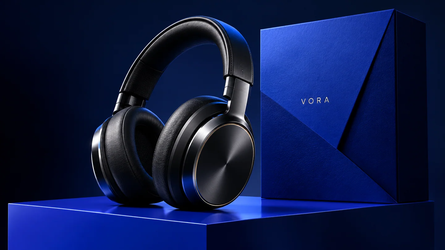
The direction brings oversized typography, a saturated blue palette, and precise product imagery into one recognisable system. It is designed to travel from packaging and merchandise to a digital storefront.
The application.
A bold packaging direction gives the product a clear presence on a shelf or a screen. The same typography, palette and image language carry into merchandise, campaign layouts and a proposed digital storefront.
Scope explored: positioning, wordmark, packaging direction, art direction, and an e-commerce visual language. This is a concept study, not a commissioned client project.
One identity.
A world of details.
Space between letters. Presence in every application.
Original concept identity system.
 THE MASTER SIGNATURE
COLOUR / TYPE / MOTION
A precise, widely spaced signature.
The signature resolves to the same master. Consistent proportions and clear space carry it from packaging into the digital experience.
One confident visual system, from the first impression to the product in your hands.
Connect the disciplines.
A direction for your brand.
A place to begin.
Plan your project FORME
Explore the next projectA quieter kind of confidence.