FORME
A quieter kind of confidence.
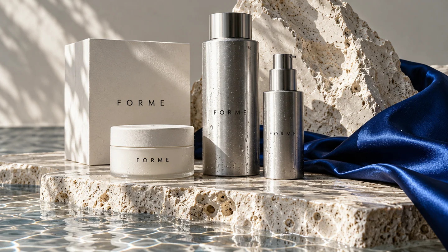
A self-initiated skincare concept built around clarity. FORME balances a restrained identity with tactile materials and deliberate, generous space.
Create a skincare direction that makes choosing feel simple. The brief explores how restraint, useful product information and tactile materials could bring clarity to a crowded category.
The direction.
Silver, white, and directional light bring the product into focus. The same logic shapes the digital direction: helpful information, straightforward choices, and a calm path to discovery.
The application.
A packaging family and storefront direction share generous spacing and a clear hierarchy. Silver and chalk-white materials create continuity between the physical product and its digital presentation.
Scope explored: brand identity, packaging, campaign art direction, and storefront direction. This original concept illustrates an approach, not a completed client engagement.
One identity.
A world of details.
A quiet signature, with room to breathe.
Original concept identity system.
 THE MASTER SIGNATURE
COLOUR / TYPE / MOTION
Light letterforms. Deliberate space.
The signature resolves to the same master. Consistent proportions and clear space carry it from packaging into the digital experience.
A calm, coherent identity that gives the product room to speak.
Connect the disciplines.
A direction for your brand.
A place to begin.
Plan your project PLAY/SHIFT
Explore the next projectSerious about the power of play.